Friday 26 February 2016

FINAL MAJOR PROJECT PART ONE!!!

I have decided to follow the theme of Illegibility and Distortion for my Final Major Project as I have a keen interest in both typography and surface patterns, so I am excited to explore the combination of these factors within the final project. The idea builds on my last project - ‘Deconstruction’ where I was following the idea of taking things apart and recreating them. I am aiming to produce a range of unique surface patterns that I could potentially use to upholster furniture and present in the manner of a collection. 

I started with a variety of research ranging from pattern books in the library to visiting the Photographers Gallery and the Fashion and Textiles Museum in London. Initial ideas included lots of collaging and cutting up of photos whilst thinking about incorporating pattern within the design. During the trip to London I wanted to get some primary drawing completed however after being unsure about subject matter I decided to simply be experimental with some simple life drawing.


The experimental approach stemmed from a workshop session where our class was encouraged to embrace new techniques such as drawing with our wrong hands, and not looking at the page. By following this process I managed to create a range of distorted faces, which made a good starting point for the project. In hindsight I believe I should have followed this process whilst looking at typography and lettering within my environment, as this would have been exceptionally relevant to my theme however I have managed to push my project forward so that the illegibility has really begun to push through. 


From looking at an artist called Linda Hutchins, I came up with the idea of drawing according to sounds, and also the sound waves that are created from typing and talking. This idea began to push my boundaries a little, however due to he extensive research I had already undertaken I was confident in being able to produce some exciting work samples. 


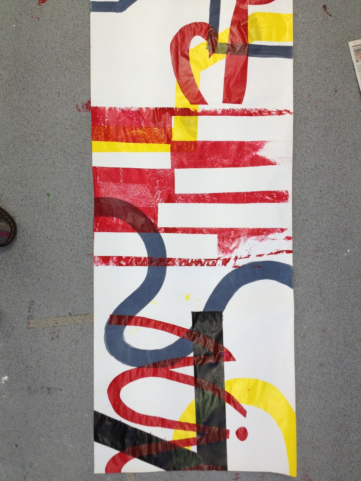
Thinking along the lines of illegibility I began to create my own typography, and one experimental method I followed was to draw with the pens in-between my fingers. This gave me hardly any control over the pressure or directions of the pens (see pictures above). One thing I have realised from this sampling is I am not being brave enough with my experimentation of media. From looking at my artist research it is clear I need to consider new media in order for my work to be as exciting as I planned.


My digital samples show a range of ideas that work strongly along the idea of Illegibility and Distortion. I chose the colour palette based on some of the prints I saw at the Liberty in Fashion exhibition at the Fashion and Textiles Museum. Contrasting bright colours really achieve the distorting effect as it almost becomes too much for the eye to look at. To develop the samples further I am now considering placing the text over a patterned background. In regards to distortion I was interested in researching the Op Art style of work and its exponents Bridget Riley and Victor Vasarely. This is something I will begin to consider after some further sampling. 


I decided to visit the Museum of Brands, Packaging and Advertising so as to give myself some primary research of typography and I think the visit really inspired me to follow a more collage way of working. The drawings I constructed within the gallery visit helped me to visualise a broad range of typography within one composition and has definitely given me scope for development within my digital sampling. 


My latest point of experimentation has been with collaging typography in order to follow the idea of illegibility. The compositions I have been experimenting with show potential and I am looking forward to developing new ideas further. 

Tuesday 12 January 2016

OPEN BRIEF - DECONSTRUCTION

The most recent project I have been working on was given to us was an open brief, and after much consideration I chose to follow the theme of deconstruction. To me the word meant endless opportunities and I had lots of ideas running through my mind, however it was the initial starting point that I struggled with. I began my research in the library and was looking at books to do with architecture, towns and signs which led me on to experimenting with collaging photos and looking at different ways I could 'deconstruct.'


My initial drawings consist of loose fine liner, where I was holding the pen at the end and not looking at the page. The experimental approach I had was helping me to keep an open mind about this project as I was unsure as to what my final outcome could possibly be. 
I then visited the exhibition at the Anglia Ruskin gallery called 'Cut and Paste' by Ivan Chermayeff which inspired me to follow the route of collage in the next stages of the project.


As you can see from the photos above I wanted to keep the majority of the drawing visible, and it is only after I started collaging that I began to deconstruct parts of the drawing and moving pieces around to form new elements and shapes. I took the colour palette from photos I took of elements of architecture, particularly around the construction site that holds the subject matter of the drawings. The red and blue contrast each other, helping to create sporadic focal points across the collage, and the third tone of the brown helps to neutralise the composition but allowing the depth to remain. 

After only having created a small selection of drawing I wanted to add something different to the work, so after some research on signs and lettering in the environment I decided to take rubbings of text from drain coverings. The results worked well and I began to use them along my collages to create bypass prints - where the images become layered up from being printed on top of. 


It was then from the collages shown above that I decided to create a further range of bypass prints, as they were becoming more and more successful. Initially I just created a series of prints however I wanted to develop even further, so thinking along the theme of deconstruction I began to consider materials I could print my images onto. I concluded that brick/concrete, metal and wood were appropriate so then began experimenting with ghost printing.


Friday 8 January 2016

SENSE OF PLACE PROJECT

This project was entitled Sense of Place, and in order to gain ideas from new sources of inspiration, our class to a trip the the city of Berlin. It was a completely new experience for me, as I have never been to Germany before, so I found that when I was undertaking drawings I was most inspired by the letters and typography around me. 


 You can see from the pictures above that I was taking a collage approach to my drawings, and I believe the style was working really well for the theme. The drawings show elements of the city Berlin and the German text strengthens this therefore giving a sense of the place. I was consistent with the materials and colour palettes that I used with this project, the red stands out boldly on the pages creating a focal point, and is furthermore complimented by the addition of blue which helps to balance out the composition. 


Upon returning from Berlin it was time to start considering ideas for a final solution. I began a developed collage which combined elements from all the drawings I had brought back with me. As you can see in the photo above, I started drawing on receipts and I feel the strongest design is the second in on the right. The colour palette of red, yellow and black represents the German flag and the elements of the drawing are strong and stand out against each other. By creating these designs on receipts it gave me the idea of designing for a strip of wallpaper. 


As you can see above I began designing a variety of strips, whilst also still experimenting with different uses of colour, however it is clear to see that the bottom two designs are the strongest. The three colours red, yellow and black compliment each other into making highlights, mid tones and dark tones which therefore enhances the depth of the design making it more successful. I particularly feel the bottom design that is just inclusive of text is especially strong in symbolising sense of place however I feel that the shapes and angles of the design which includes drawings has more variety and potential to be developed.


From the photos you can see my final screen print for this project. I opted to print on a long strip of paper to give the sense of it being either wallpaper or a large wall hanging. The colours are vivid and stand out strong against the white of the paper. Although I had a slight idea of composition for the design, I was deciding where to print the stencils as I went, and I feel this spontaneous approach works well, as it keeps a sense of fluidity to the design.


Overall in this project I feel I was successful in making decisions and trusting my own judgement. I was experimental in following a new way of working, and this led me on to discovering an outcome I had never imagined for this project. To develop even further I would like to perhaps use the leftover stencils from the screen print to create large collages, that link with the screen print and perhaps then create a series of art that makes a collection.


Wednesday 28 October 2015

TRACE ELEMENTS PROJECT

For this project I explored many ideas and whittled it down to following the idea of journeys, and capturing traces of them in my work. Taking into account the 'you are what you eat' project, I decided I wanted to carry on in a similar style of working - particularly following the idea of print. 


 I began with some simple mono-prints which I believe were a good starting point. The print on the left is a panoramic drawing, giving the idea of taking a journey with your eyes - which is enhanced by the two point perspective, that allows your eyes to travel along the piece. The depth could potentially be enhanced by a subtle addition of colouring the background. The print on the right does contain colour, however the line-work is not panoramic meaning the depth is not as pronounced. The green strip of colour takes the role of focal point in this piece. These mono-prints led me on to the idea of experimental continuous line drawings, where I decided to document my journey to college, and draw whilst walking.


Although the drawings were simple to create, the outcome is really successful and contains plenty of potential to develop. By being presented across a double page spread it gives the feel of the drawings being panoramic which instantly adds the element of depth. Plus, where in places the single line has overlapped on itself it has created a further sense of depth by drawing you into the background. The line drawings work well as a single black line as they stand out into the foreground as a focal point, however I could develop these into prints onto a coloured background as this would further enhance the overall composition. Instead I chose to take shapes from them in order to create a background print. These samples can be seen in the pictures below. 


The two prints above really begin to document my journey in further detail. The collaging in the background initiates further depth and pushes the blue print into the middle ground therefore allowing the letterpress to stand out into the foreground. The sample on the left stands quite strong in catching your immediate attention, and the shapes created by the negative space are prominent. On the other hand, the print on right contains plenty more texture as the blue ink had been reduced, this allows for the collaging to come through, adding yet another layer to the print. Although both these prints have their strong points, I felt I could develop the idea further into creating a series of smaller prints based on my journey to college. 


A few of the samples I created can be viewed above, they demonstrate some of the different  techniques I used to approach the final outcomes. The colour palette was taken from a part of the journey, and the clashing colours really create an impact which is highlighted by the negative space that allows the composition from being overcrowded. The surface area is very tactile due to the addition of stitch and collage. This gives an interesting texture both visually and to the touch which therefore adds further depth to the samples. 


Monday 26 October 2015

YOU ARE WHAT YOU EAT PROJECT

This was a short independent project, set to see how we begin to work independently, and to help us in our chosen specialism. 
Initially I began with some experimental drawings, however I soon realised these weren't working so I trialled printing.


As you can see from the 8 samples above I found a simple method that was working really well. It is a straightforward combination of collage and coloured ink,whereby I began slicing found berries and apples and then printed their surface pattern onto the collage. By watering down the ink in places it has created a fluid feel to the samples, and blends together the red and quink ink. I think the most successful element of the above samples is the unpredictable  shapes created by the berries. By having different forms rather than one repetitive shape it enhances the depth, and heightens the sense of that natural elements. The idea of 'You are what you eat' comes into account by the use of apples - a common fruit seen daily - against the wild berries. The apples symbolise the idea of comfort zones, and how we often stick to what we know and are afraid to try new things but the berries represent temptation and the idea of something new - i.e you are what you eat.
During this process I learnt to trust in myself, and that its okay when an idea doesn't end how I would have liked, and to just work with it to create a better and more exciting method. This helped me to look at these prints and think in advance as to how they can be developed onwards. 
Because I am interested in Textile Design, I chose to move my work into the digital side, and began creating surface patterns.


As you can see I started using Photoshop to group together my samples, which resulted in the above and below outcomes. Once I began sampling I really got into a flow, which was really successful in helping my own personal development. It has helped me to advance in believing in a good idea and enabled me to produce strong digital samples. The above sample on the left was the first I produced, and also where I discovered the use of the overlaying tool. The composition is strong, and the vertical layout has produced leading lines that ensure your eyes cover the whole of the piece. The overlay is effective as it creates many layers in the sample, producing a vast depth. There are hints of text across the background which adds a strong texture to the piece. It also gives a sense of mystery, by making them less visible it enhances the idea of the berries being a temptation. You lean into the background in order to see what they are.
The same could be said for the sample on the right, however the depth is intensified by the addition of the collaging in the background. The colours begin to become darker and more vibrant in this sample, intensified by the negative space, which gives the impression of the fruit being richer. 


The two samples above have less of a 'pattern like' feel to them, and there is much more going on in the overall composition. With the piece on the left the depth is grand, and all the different layers really capture the attention of the viewer. The bold colours push out into the foreground, contrasting greatly with the faded background, which really enhances the depth of the piece. Whereas the piece on the right, although still containing many textures and layers, has a clear white background where the negative space pushes all the details into the foreground. 
Overall in this project I feel I really began to blossom in what I was creating, and although it was difficult working independently, it is clear within my work that I am along the right route to becoming a textile designer. 


TATE MODERN REVIEW 29/9/15

Our newest project lasts 3 weeks and is entitled 'Trace Elements' and to help push start ideas we took a trip to the Tate Modern in London to view the exhibitions on show - one of them being 'Making Traces'. To me the most significant room that stood out most to me was called 'Painting After Technology' which consisted of a brilliant collection of mixed media paintings. 


Loa, 2007, Acrylic paint, oil paint, collage, ink on canvas
The most prominent piece I found was by Albert Oehlen, which can be seen above. There piece contains traces of imagery, text and collage from many different places, including quotes and song lyrics, which produces a relaxed atmosphere, allowing the viewer to relate comfortably to the piece. The piece reminds me of an advertising billboard - due to the large title and the bar-code that is visible beneath a translucent layer of paint. The multitude of layers is pertinent to my own work and a method I am definitely going to carry out within my own pieces. The main focal point of the piece is the text, however there is also evidence of other shapes - predominantly the spherical forms. Taking position in the bottom left corner, the tones of blue emphasize the spherical element which therefore adds depth to the painting overall. They also create a fluid feel to the piece as the edges create leading lines diagonally into the center, therefore enhancing the center focal point.


Walls Paper, 1972, Offset lithographs on newsprint paper
This piece by Gordon Matta-Clark grabbed my attention straight away, mainly due to the sheer vastness of it. Floor to ceiling covered with lithographs. But the beauty of it was how they were all pinned up individually, rather than being printed on a roll of wallpaper. This rawness stood out and has definitely helped to inspire my Trace Elements project. The subject matter consists of architectural elements from photographs - predominantly the interiors of torn down houses. The angular shapes that are created are instantly softened by the textures of the inks within the print. The colours are neutral a part from the highlights of bright yellow, blue and green -  which instantly creates a multitude of focal points across the wall. The composition is strong due to the placements of the focal prints, it ensures your eyes are drawn all the way across. However, when you walk away then go and re-look at the piece, you begin to notice elements that were missed upon the first viewing, but this only enhances the size of the piece. 

Sunday 20 September 2015

WEARABLE ARCHITECTURE PROJECT

This project is perhaps the one I was most excited about doing because Textile Design is what I am considering going on to do at University. Therefore I felt the need to really excel with this task in order to prove my abilities to myself. 


The project kicked off with observational drawings of buildings, where we had to focus on the inner, smaller details such as shape. At this point I was disappointed in the outcome of my work as I felt I hadn't understood the task properly; but in hindsight, the shapes I had found work really well together and once I began to print them I was really enjoying the development of my work. I feel that this was a really successful learning curve for me, as it is sometimes hard to accept your work when you feel it is not up to your usual high standards, as I did, and the development of being able to overcome a difficult patch and twist it to make it work to the best of its ability is something I am proud of achieving and I definitely feel it will help me with future learning.


Once I was over my frustration we moved on to designing a surface pattern for printing the shapes, which you can see above. The colour palette I chose is working really well for this piece as the neutral background allows the pink and blue to pop out without them drowning each other - because I chose to also use the secondary colour purple as a highlight point. Although I believe my prints are successful there is still plenty of room for development, for example instead of using purple I could print with white paint as it would stand out even further in the print and give a sense of depth. A second developing point could be to somehow attach the stencils onto the surface of the print which would not only add a three-dimensional aspect but also enhance the 'wearable sculpture/architecture' idea. 

We then had to refer back to some of the other architectural shapes in order to design the final idea for the piece. Above you can see my range of ideas, and I feel the most successful one is the middle idea, featured in the left hand photo on the right hand side. This is mainly because I wasn't looking at the shape and trying to turn it into a garment, but instead I was considering the ergonomics of the shape and how it could work best with the body. The two designs shown in the photo on the right have the success that they both flow well with the body, however I find that the curves soften them too much and they blend too much with the body, whereas the more angular shapes stand out strong and make a statement. 


The final stage of the project was choosing a design and putting it into practise, which you can see in the photos overhead.