This project was entitled Sense of Place, and in order to gain ideas from new sources of inspiration, our class to a trip the the city of Berlin. It was a completely new experience for me, as I have never been to Germany before, so I found that when I was undertaking drawings I was most inspired by the letters and typography around me.


You can see from the pictures above that I was taking a collage approach to my drawings, and I believe the style was working really well for the theme. The drawings show elements of the city Berlin and the German text strengthens this therefore giving a sense of the place. I was consistent with the materials and colour palettes that I used with this project, the red stands out boldly on the pages creating a focal point, and is furthermore complimented by the addition of blue which helps to balance out the composition.

Upon returning from Berlin it was time to start considering ideas for a final solution. I began a developed collage which combined elements from all the drawings I had brought back with me. As you can see in the photo above, I started drawing on receipts and I feel the strongest design is the second in on the right. The colour palette of red, yellow and black represents the German flag and the elements of the drawing are strong and stand out against each other. By creating these designs on receipts it gave me the idea of designing for a strip of wallpaper.

As you can see above I began designing a variety of strips, whilst also still experimenting with different uses of colour, however it is clear to see that the bottom two designs are the strongest. The three colours red, yellow and black compliment each other into making highlights, mid tones and dark tones which therefore enhances the depth of the design making it more successful. I particularly feel the bottom design that is just inclusive of text is especially strong in symbolising sense of place however I feel that the shapes and angles of the design which includes drawings has more variety and potential to be developed.


As you can see above I began designing a variety of strips, whilst also still experimenting with different uses of colour, however it is clear to see that the bottom two designs are the strongest. The three colours red, yellow and black compliment each other into making highlights, mid tones and dark tones which therefore enhances the depth of the design making it more successful. I particularly feel the bottom design that is just inclusive of text is especially strong in symbolising sense of place however I feel that the shapes and angles of the design which includes drawings has more variety and potential to be developed.

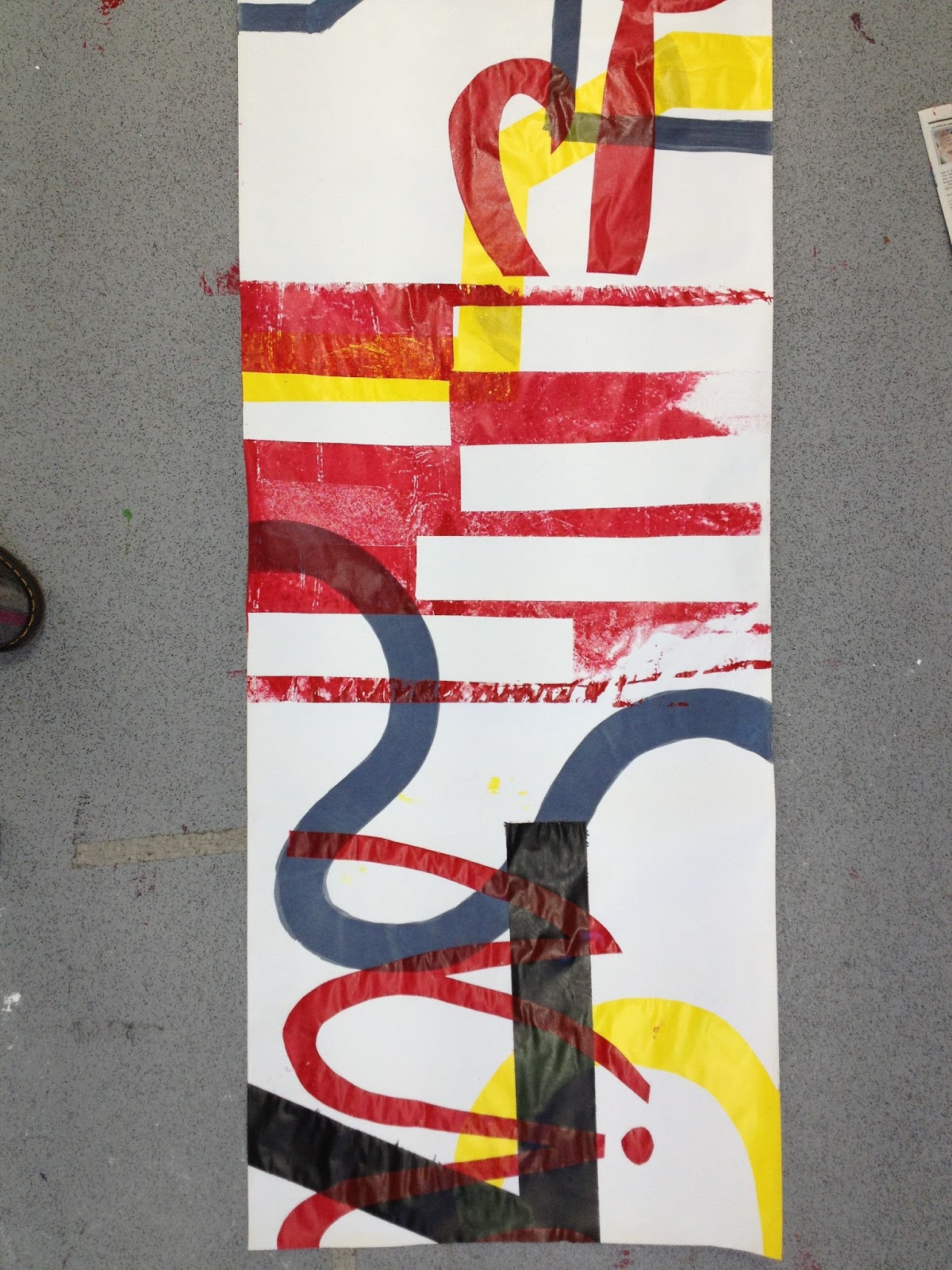

From the photos you can see my final screen print for this project. I opted to print on a long strip of paper to give the sense of it being either wallpaper or a large wall hanging. The colours are vivid and stand out strong against the white of the paper. Although I had a slight idea of composition for the design, I was deciding where to print the stencils as I went, and I feel this spontaneous approach works well, as it keeps a sense of fluidity to the design.

Overall in this project I feel I was successful in making decisions and trusting my own judgement. I was experimental in following a new way of working, and this led me on to discovering an outcome I had never imagined for this project. To develop even further I would like to perhaps use the leftover stencils from the screen print to create large collages, that link with the screen print and perhaps then create a series of art that makes a collection.
No comments:
Post a Comment