The most recent project I have been working on was given to us was an open brief, and after much consideration I chose to follow the theme of deconstruction. To me the word meant endless opportunities and I had lots of ideas running through my mind, however it was the initial starting point that I struggled with. I began my research in the library and was looking at books to do with architecture, towns and signs which led me on to experimenting with collaging photos and looking at different ways I could 'deconstruct.'

My initial drawings consist of loose fine liner, where I was holding the pen at the end and not looking at the page. The experimental approach I had was helping me to keep an open mind about this project as I was unsure as to what my final outcome could possibly be.
I then visited the exhibition at the Anglia Ruskin gallery called 'Cut and Paste' by Ivan Chermayeff which inspired me to follow the route of collage in the next stages of the project.

After only having created a small selection of drawing I wanted to add something different to the work, so after some research on signs and lettering in the environment I decided to take rubbings of text from drain coverings. The results worked well and I began to use them along my collages to create bypass prints - where the images become layered up from being printed on top of.


It was then from the collages shown above that I decided to create a further range of bypass prints, as they were becoming more and more successful. Initially I just created a series of prints however I wanted to develop even further, so thinking along the theme of deconstruction I began to consider materials I could print my images onto. I concluded that brick/concrete, metal and wood were appropriate so then began experimenting with ghost printing.


My initial drawings consist of loose fine liner, where I was holding the pen at the end and not looking at the page. The experimental approach I had was helping me to keep an open mind about this project as I was unsure as to what my final outcome could possibly be.
I then visited the exhibition at the Anglia Ruskin gallery called 'Cut and Paste' by Ivan Chermayeff which inspired me to follow the route of collage in the next stages of the project.

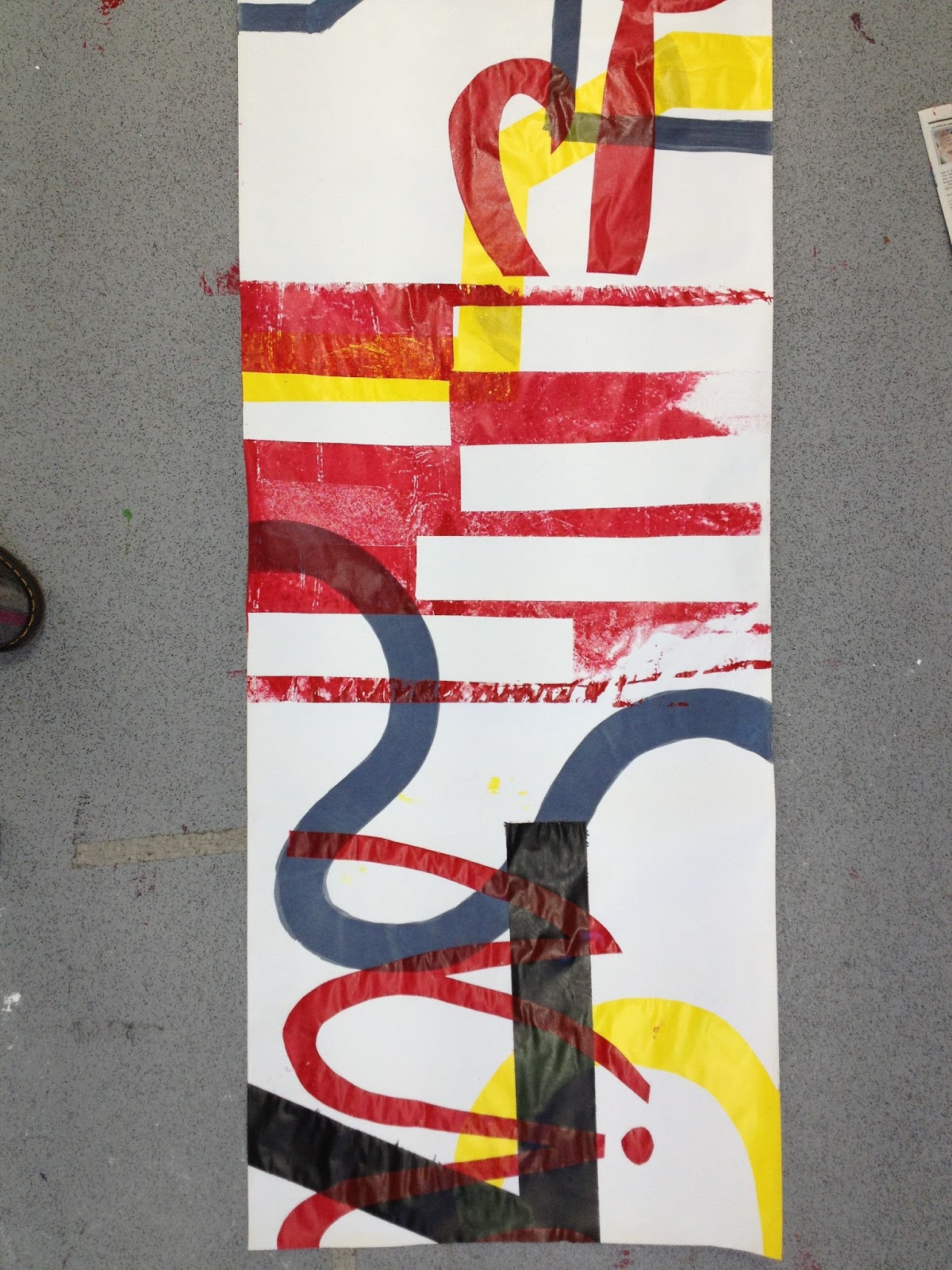
As you can see from the photos above I wanted to keep the majority of the drawing visible, and it is only after I started collaging that I began to deconstruct parts of the drawing and moving pieces around to form new elements and shapes. I took the colour palette from photos I took of elements of architecture, particularly around the construction site that holds the subject matter of the drawings. The red and blue contrast each other, helping to create sporadic focal points across the collage, and the third tone of the brown helps to neutralise the composition but allowing the depth to remain.
After only having created a small selection of drawing I wanted to add something different to the work, so after some research on signs and lettering in the environment I decided to take rubbings of text from drain coverings. The results worked well and I began to use them along my collages to create bypass prints - where the images become layered up from being printed on top of.


It was then from the collages shown above that I decided to create a further range of bypass prints, as they were becoming more and more successful. Initially I just created a series of prints however I wanted to develop even further, so thinking along the theme of deconstruction I began to consider materials I could print my images onto. I concluded that brick/concrete, metal and wood were appropriate so then began experimenting with ghost printing.